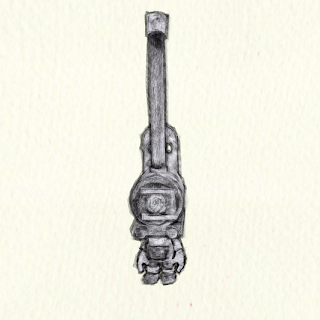
Crayon / Charcoal BGE test (train face boy)
Hi all just posting this here to get feedback on how stuffs looking. I’m doing my honours project at Abertay Uni. Its about making game art look more traditional art. Here’s a post with me testing to make crayon and charcoal look. This is just lifted from my blog found here: http://alshonours.blogspot.co.uk/Any comments or questions welcome. If your interested please follow my blog as I’ll be updating very regularly.
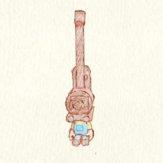
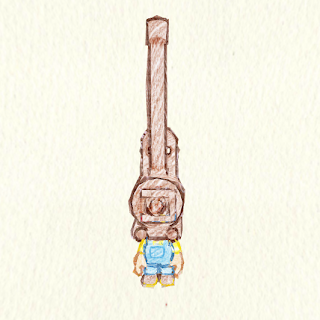
For this test I’m taking some advice from the lecturers at my pitch and working on one of my own characters. This is a character i came up with a few years ago on the way back from collage on the bus. I don’t have the original sketches but i did some new ones in Crayon:
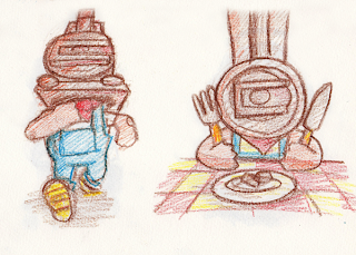
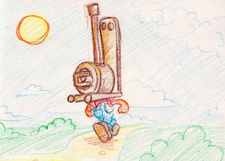
I also wanted to do the charcoal images as I though it may better suite the nature of a mucky train face boy. I made the mesh rigged it and animated it back then so thought i could just add textures to look like Crayon/Charcoal.
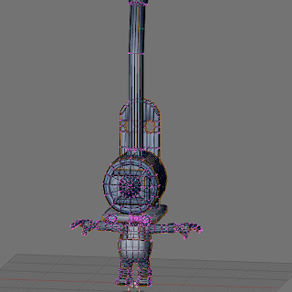
2 Crayon versions of UV

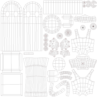
Next step was to make the outline. I did this in the same way as the knight example. Duplicate the mesh,scale along normals, inverse normals so faces are pointing inwards, apply outline image made from a segment from the hand drawn uv map. The charcoal map worked a lot better in this test.

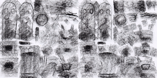
Then a displacement modifier was added to the mesh with a butt image generated in blender. One thing i did differently from the knight test was i used a different butt map on the second outline creating more edge variation instead of just a double border. This is the crayon with the crayon outline x2. It looks soft and like crayon drawing. the texture also animates.
In this on its crayon again but this time I expanded the mesh and used the same texture with a slight colour change to darken the values to make a context aware outline, ie the yellow arms have slightly darker outlines. The brown in this seems too harsh when compared to the first image.
This image shows the first of the 2 charcoal tests, this one has an animated texture and animated outline, the dynamic changing in outline works will with the overlay of the 2 outlines and creates definite dark areas.
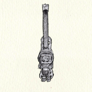
This one is charcoal again but i applied the displacement modifiers which means it dose not wobble like the other examples. the way the displacement applied was different to the way it was previewed which was a little annoying as i didn’t get the sharp contrast and strength in dark ranges as in the first charcoal test. but in action it looks more peaceful than the above test.
Charcoal may do with a slightly cooler paper colour.
I also posted this on BA here: